Label of love
Some labels tell you what’s inside the bottle. Others carry the spirit of the land it came from.
At KSD, we believe great design is rooted in story, place and purpose. Our recent collaboration with TEAKLE Wines is a proud expression of that belief.
Formerly known as Peter Teakle Wines, the transition to TEAKLE Wines marked more than a name change. It signified the beginning of a new chapter that honours the pioneering spirit of Peter Teakle while also looking ahead under the thoughtful leadership of Ben Teakle.
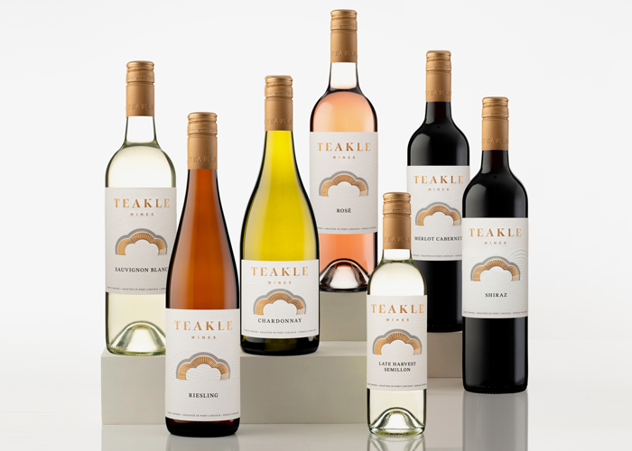
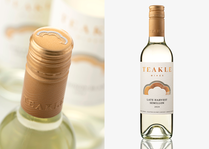
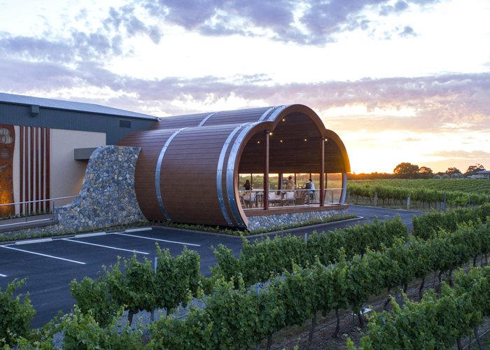
Our role was to interpret this legacy through a contemporary brand lens. We began by listening closely. Working respectfully alongside Ben and his team, we developed a deep understanding of the values and ambitions shaping the business. This insight became the foundation for a brand identity inspired by the estate’s most distinctive elements: the barrel-shaped cellar door, the estate-grown vineyards and the cool maritime breezes that influence every vintage.
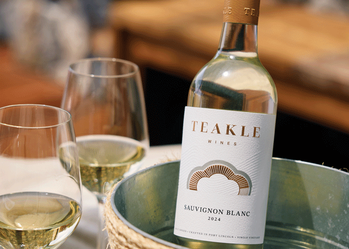
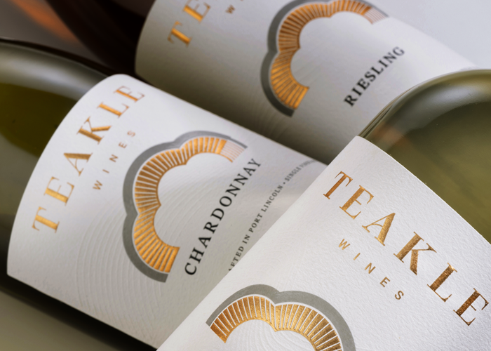
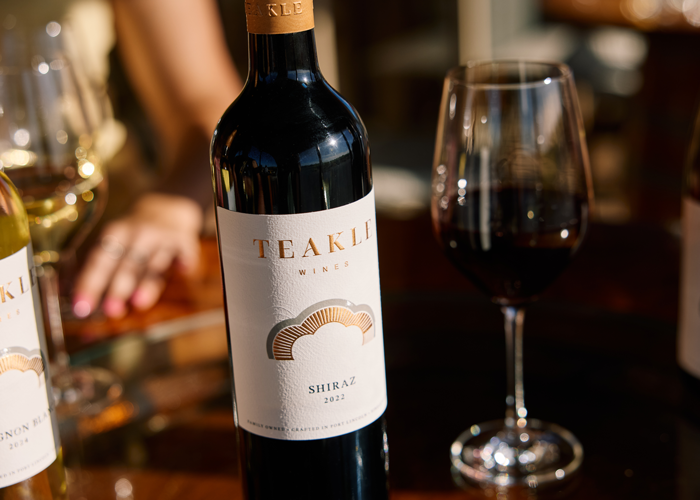
Each label features hand-tooled, embossed line work that expresses the connection between ocean and land. Combined with a cohesive brand architecture, the range presents with both strength and elegance across every touchpoint.
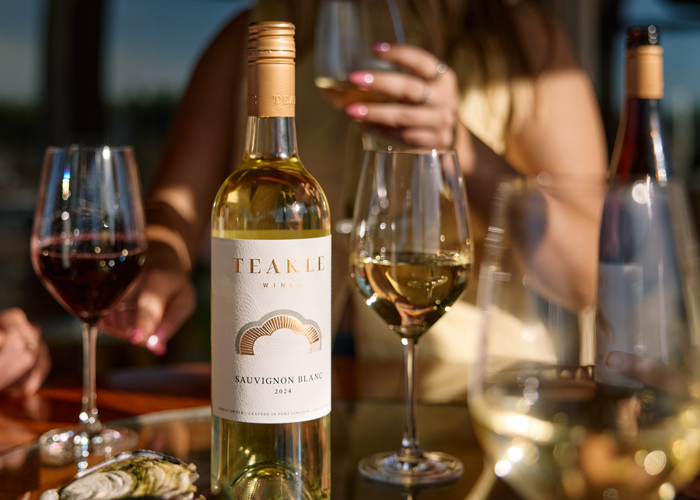
The project was delivered within a strict timeline and the response to the first release was immediate and enthusiastic. It was a reflection of the care, clarity and collaboration behind the work.
It was a privilege to partner with the TEAKLE Wines team and our long-standing print partners at MCC, bringing this story to life with creative purpose and pride.
Published:
WBM: Wine Business Magazine
April 2025

.png)